Zune Thoughts: Gizmodo Looks at the Zune

Be sure to register in our forums! Share your opinions, help others, and enter our contests.


Laptop Thoughts

Loading feed...

Windows Phone Thoughts

Loading feed...

Digital Home Thoughts

Loading feed...


Saturday, November 4, 2006

Gizmodo Looks at the Zune

Posted by Jason Dunn in "Zune Talk" @ 01:38 PM
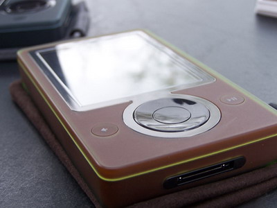
http://gizmodo.com/gadgets/portable-media/zune-first-full-review-212255.php

"The UI is snappy and has lots of zooming, sliding and various cool effects when you're navigating. Luckily, the eye candy doesn't get in the way of usability. The click-pad isn't too bad to use, but it's not touch sensitive like the iPod wheels. The community menu options like sending files and pictures are all over the place. If you hit the middle button to get the context menu, you'll most likely notice an entry called "send", where you can send what you're currently listening to to nearby Zunes. Overall the UI is pretty well designed, and iPod users shouldn't be lost if they decide to migrate."


When it rains, it pours: Gizmodo has published their detailed look at the Zune. Not much new can be said here: they cover all the basics, and point out how great it is that it's upgradeable. This is something I've talked about before, but I think the Zune team is quick to point this out to every reviewer because they have some great stuff planned, but can't be specific about features or time frames. This much is certain: the WiFi on-board gives Microsoft tremendous potential for innovation, and I for one am confident that they'll do exactly that!

Tags: review, gizmodo

Reviews & Articles

Loading feed...

News

Loading feed...

Reviews & Articles

Loading feed...

News

Loading feed...

Reviews & Articles

Loading feed...

News

Loading feed...

Reviews & Articles

Loading feed...

News

Loading feed...

Reviews & Articles

Loading feed...

News

Loading feed...

Sponsored links