Saturday, August 22, 2009
Impressions from Best Buy Zune HD Hands-On
Posted by Adam Krebs in "Zune Hardware" @ 11:22 AM
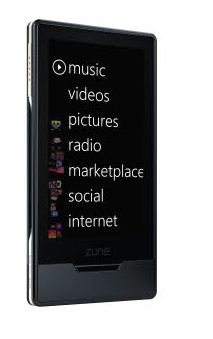
I just got back from my "local" (half hour away...ugh) Best Buy to take a look at the forthcoming Zune HD. I was pretty impressed with what I saw, and I'm definitely looking forward to picking mine up when it comes out. Here are a few things I noticed and thoughts I have about the device, and I'm mostly trying to avoid repeating anything that has been said before. Forgive the short-hand, but I'll try to clean it up later.

- Press and hold the screen while in a song to bring up the option to "pin" a track, which shows up along with Now Playing and History to the left of the main menu
- Now Playing screen folows the Zune Software more closely, with artist pictures and track info scrolling by slowly. Looks amazing on HDTV
- Now Playing playlists can be saved to the device for later use, and even sent via the Social to yourself or other people to look at later. A keyboard pops up so you can name the playlist.
- Now Playing list didn't seem to have many advanced features, only a Clear All and send button. The presenter tried to do a clockwise-circular gesture to re-arrange tracks, but apparently this was removed since an earlier version
- He wasn't allowed to show off Marketplace, Social, or Internet features, since they weren't finished yet.
- These features don't show up when the Zune is docked to the TV. Says it has nothing to do with wifi, just that they haven't finalized a version of these for 10-foot viewing. May come out in a future update
- I got to hold the device to feel its heft, and it's surprisingly light. Screen seems very responsive, and the buttons tactile. The "home" button below the screen is slightly beveled, which felt good to press.
- Notifications pop up at the bottom of the screen, a bit like the "curtain" on the Palm Pre. When you do an action like pin a song or clear a list, it will show up in this area, and not show up as an overlay the way it does currently on the 3.0 firmware.
- There are no sliders in the Now Playing screen. To seek within a track or change the volume, you must hold one of the buttons on the screen
- Changing tracks can also be accomplished via a swipe gesture, similar to the one currently used with the Zune Pad.
- The "twist" interface has been retained (as you've likely seen in screenshots), but anywhere in the main area of the screen can be swiped right or left to accomplish the gesture.
- Artist bios, pictures, and related artists all look incredibly well implemented, and it seems a great evolutionary step
- The packaging appears similar to the second-generation product, and comes with regular (non-"premium") headphones and a sync cable that doesn't look to have changed much since version 2
- The HD dock will not accept the original Zune 30, since it "simply will not fit." Apparently has more to do with size than anything else.
All in all, a number of welcome improvements (like saving Now Playing lists, HD radio, and of course the beautiful transitions), and a number of things I hope they'll fix in coming updates. No matter what, this definitely appears to be something the Zune team can be proud of. Great stuff.


