Monday, July 13, 2009
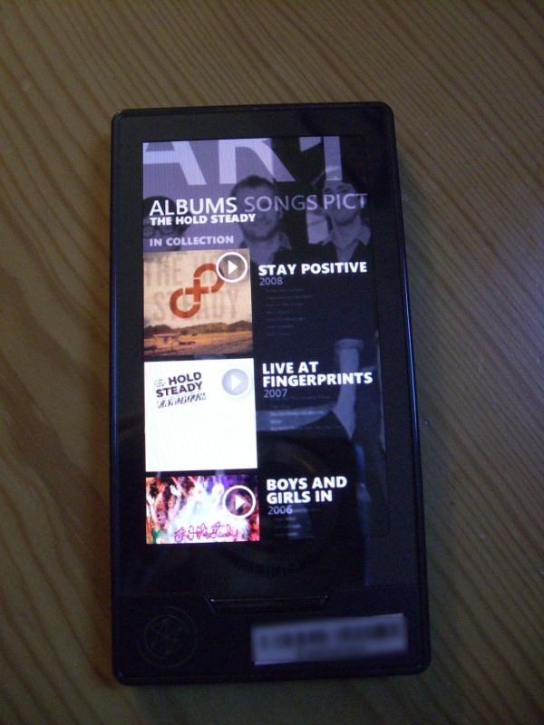
Shot of Zune HD Marketplace Surfaces, Intrigues
Posted by Adam Krebs in "Zune Media" @ 10:00 PM
I know it's a little late by Twitter standards, but this is a Zune site so why not?

Engadget's Ross Miller doesn't think this picture is interesting by itself. I would both agree and disagree; the picture itself isn't too interesting, but taken in context it reveals a few key tidbits. For starters, it looks like they're retaining the Twist UI paradigm, which was introduced all the way back in Zune 1.0. It looks like the artist views are going to start imitating the "enhanced now playing" in the Zune software a little more, with band pictures and info popping up when you scroll through music (see a better shot here.) Also, it appears that the Marketplace and Collection will begin to look a little more closely related, with dynamically-generated previews of the tracklist shown below the album title and release year (see above.) September 8 can't come soon enough.


