Friday, January 9, 2009
More "2-Cent Suggestions"
Posted by Adam Krebs in "Zune Software" @ 10:30 PM
So I sort of got on a roll with yesterday's device suggestions, and I thought I'd try my hand at picking out some of the small things that bug me in the Zune Software. These should be mostly small fixes, but ones I think would greatly increase my enjoyment with the software.

Sync screen:
- Separate out things I've chosen to sync with things synced automatically through friends' ZCards, Picks, and Channels.
- Progress bars. I like progress bars, and I miss them from Windows Media Player 11/Zune v1. They provide a granular view of everything syncing, with options for each track. The Zune 2.0 and 3.0 software feels very spartan in this regard.
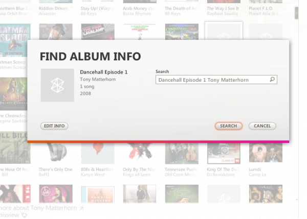
Find Album Info and Album Art
- Simply put, the code for "Find Album Info" should be re-written. It hangs on me 90% of the time, and has only worked a couple times. Even then, it typically doesn't work work on more than one album without restarting the software.
- The browse for album art dialog always opens in My Pictures (or in Vista, Pictures). Most times when I'm downloading album art from the web, I save it to my desktop. The software should remember my last-used location.
- Lastly, I wish there was an option to resize the album art. The new "Albums" view of the music field is cool, but really doesn't address the core issue of either hard to see thumbnails or oversized album art. Give us a slider control like in Windows and Windows Media Player.
Now Playing screen:
- There needs to be an option (a la Windows Media Player and practically any other jukebox software) to interrupt the screen saver when playing a video.
- Similarly, in most programs, hitting the space bar will pause the currently playing item. In Zune, it repeats the last action performed (e.g. advancing a track, turning on and off shuffle, etc.). This is especially a pain while watching a video, since you have to press the space bar once to bring up the controls, then again to pause it. Make space bar = pause on a high level.
- I love the album art tiles screen, and so I wish there were more settings. If I could control the idle timeout before going to the tile screen, or disable a mouse interrupt (e.g. have to click the button to leave Now Playing), that would be awesome.
Did I miss anything? Anything you'd like to see changed? Sound off in the comments!


