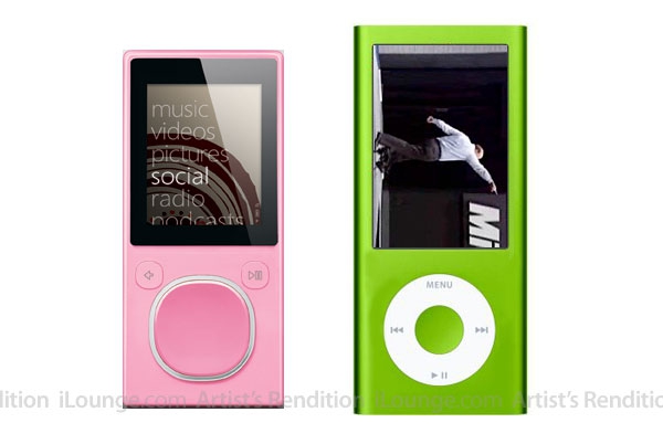
Wednesday, July 30, 2008
Fourth Generation iPod Nano Will Look Like a Zune?
Posted by Jason Dunn in "Digital Home Hardware & Accessories" @ 10:18 AM
"It may be hard to believe, but from what we've now heard from multiple sources, it's true: the fourth-generation iPod nano will look like... a Microsoft Zune. Well, sort of. Contradicting speculation that Apple was planning to transform the new nano into a miniature iPod touch, complete with a smaller touchscreen, we've been told that this year's nano upgrade will go in a different direction. Described by one source as looking like "a Zune Flash... or whatever it's called," the new nano has a vertically (tall) oriented display with a Click Wheel underneath, preserving the button-based control scheme that users have found easiest to use without looking down at the screen. The new nano's screen will gain the same 1.5:1 widescreen aspect ratio as the iPhone and iPod touch, versus the 1.33:1 ratio of the prior iPod nano and iPod classic, and you'll rotate the device to watch videos on it."
 Does this surprise anyone else? It doesn't surprise me. The design of the Nano "fatty" never seemed particularly appealing to me - the screen was too small to be useful for, well, really anything. And it's not like the second generation Nano was too big - I liked the design it quite a bit, which is why I like the design of the Zune 4/8 so much. It's a nice balance of screen size and functionality, and about the only way I'd improve the outer design of the Zune 4/8 would be to make the screen bigger, nixing that huge bezel. I'm not convinced that a wide-screen aspect ratio screen is appropriate for a device this size - what do you think? I really want to see the Zune 80 gain a wide-aspect ratio, WVGA resolution screen, but on a device as small as the Zune 4/8...would you want to watch movies on it?


