Friday, November 17, 2006
Beauty or the Beast?
Posted by Aaron Roma in "Zune Hardware" @ 03:00 PM
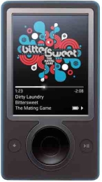
"I thought that Microsoft had already learned its lesson with the bulky/clunky XBox which many people didn't want in their living rooms. Microsoft learned its lesson and came out with the XBox 360 which was sleek and sexy. My question to Microsoft is why they couldn't have applied this same lesson to the Zune? Why waste an entire product cycle? A music/video player is even more fashion sensitive than a game console."

Technical specs and performance aside, the Zune has a fairly unique look. Most people either love it or hate it. George Ou over at ZDNet obviously is in the "Hate It" camp. Maybe this first generation device doesn't quite have the sex appeal of the iPod, but personally, I’m pleased with the design. I would like the see the size trimmed down a bit. The "double-shot" color is something that you can't truly appreciate until you see it in person. The article gives Microsoft bad points for the Zune's "ugly and clashing colors", while recommending the Zune team should have taken a clue from the Sansa's fashion savvy color scheme. I guess SanDisk's use of blue on black design is better than Microsoft’s use of blue on black. :) It's also interesting to note that while the article is extremely critical of the Zune’s attractiveness, the included audience poll is almost dead even (at the time of this writing.) So how important are looks in the DMP world? How does the Zune stack up?


