Tuesday, November 14, 2006
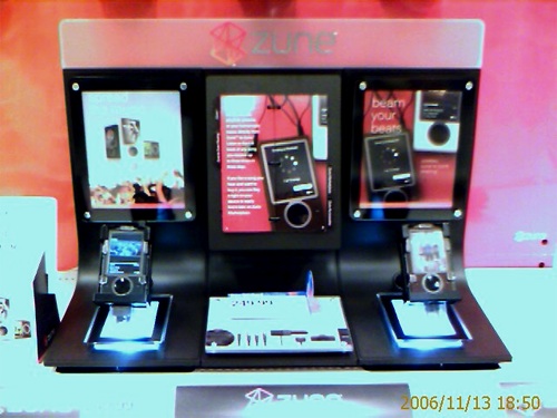
Gigabeat S User Gets Hands-On at a Zune Kiosk
Posted by Aaron Roma in "Zune Talk" @ 10:00 AM
"The fonts and animations are pretty slick. Very smooth and modern looking. The 3″ screen looks very big and provides a nice canvas for the album art displayed during playback. Pretty flashy compared to the iPod’s menus. Oh yeah, instead of a small square of album art as on the Gigabeat S, the album art fills the screen, and the progress bar and song information are overlaid in white text."

Blogger, and apparent Gigabeat S user, Jezlyn, stumbled upon this Zune display while shopping at Target. Jezlyn spent some time playing with the display units, and as offered up some thoughts, insights, and comparisons to the Gigabeat S experience. Overall, Jezlyn seems quite pleased with the Zune and how it stacks up to the Toshiba unit. She did notice that the display unit didn't seem to have any options in the menus for the wireless features. Hmm.... maybe more on this later. :) While I was out and about yesterday evening, I noticed several Zune displays: Wal-Mart, Circuit City, Best Buy. Unfortunately all where either enclosed displays, or in the units were either non-functional or not plugged into power. Has anyone else had a chance to play with a Zune display yet?


