Tuesday, October 2, 2007
Higher-Resolution Spy Shot of v2 Zunes Posted
Posted by Jason Dunn in "Zune Hardware" @ 10:20 AM

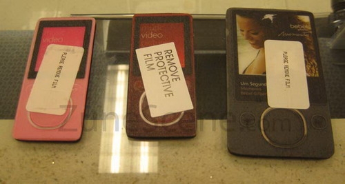
Here's the high-res version of that same photo if the Zune Scene forums are sluggish (seems the interest level is quite high). It seems like the more secret something is, the worse the photo ends up being. Zooming in a little on the bigger photo, here's my analysis of what we're seeing so far:
- The hard drive-based unit on the far right looks a fair bit thinner than the v1 Zune. It's hard to say for sure of course without having a side-angle view, and maybe these are just cardboard mock-ups that don't map to the same physical dimensions as the real thing, but if you look at the angle of the edge, it looks iPod-esque thin. Wouldn't that be great if the Zune wasn't as chunky?
- I've seen some people say that there's only going to be one colour for the hard-drive based player: that's possible, although it would be unfortunate for the Zune team to make so many cool colours and designs for the v1 Zune and have it all go away for just a single black Zune. If there has to be one colour, black is the best choice. I find it hard to believe, however, that the Flash-based Zunes are going to be only sold as either pink of brown. That would be...horrible. I'm not one of those brown-bashers, I think it looks quite good, but I didn't buy the brown Zune for myself, so if the only choices are brown and pink, that would be a very bad thing. I can't believe the Zune team wouldn't also have a black and/or white option in there as well.
- The "squircle" looks decent - hopefully it's not awkward to use.
- The buttons looks like they're some sort of soft-touch implementation - not quite touch-sensitive buttons, but not quite the manual clicker buttons.
UPDATE: Kostas Tzounopoulos from Zune-Online was kind enough (thanks man!) to drop us an email with a link to his Flickr gallery with the really-for-real high resolution (5 megapixel) images. Check out this high-res image to see the mock-ups in all their mock-glory. There's nothing like 5 megapixels worth of blurred pink Zune!


