Thursday, October 5, 2006
on10.net 16-Minute Zune Walkthrough
Posted by Jason Dunn in "Zune Talk" @ 03:43 PM

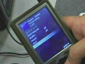
Watching the video (download the high-res version if you can, it's nice to watch), here are some points I gleaned:
- You can flag songs - it's a discovery tool. When you find content that you want to remember later, you can flag a song and it will be tagged as such when you look at your library in the Zune desktop software.
- The slideshow feature looks completely identical to the Portable Media Center version. Hopefully the performance improved - I was using my Gigabeat S the other day, showing a friend some standard photos (320 x 240) and was appalled when the player threw up the "waiting" icon. For a 30 KB file? Come on, that's just lame.
- The Zune was designed for landscape functionality: the circular intendation on the back matches up with the directional pad on the front, giving your fingers on the back a natural place to rest to line up with your thumb on the front.
- Just like the PMC, the navigation buttons change in landscape to be logical - when you're in landscape mode the left/right buttons become the next/previous buttons. I couldn't tell if the image zoom feature from PMC 2.0 has been retained or dropped from the Zune.
- Personalization is important to the Zune team. The Zune will crop and scale images to make it the wallpaper for the device. I get the feeling this is totally automated, which means it will likely be hit or miss in terms of how well it will work with all images.
- They talked a bit about the screen quality - it's so hard to judge the quality until I can see it in person, but based on the videos and photos I've seen, it looks very crisp and high-contrast. I hope it's better than the screen on the Gigabeat S - it doesn't have a bad screen, but when compared to my Zen Vision:M, it's noticeably more pale and lacks "punch".


